


Have you heard of the Blush method? Developed by Cécile Mahéo, an interior colorist who guides her clients through their renovation and decorating projects, it uses symbolism, technical skills, and the psychology of colour to create colour harmonies tailored to their needs and personality. Welcome to Maison Blush!

Cécile Mahéo

Cécile, can you introduce yourself?
My name is Cécile Mahéo, and I live in the Aveyron region of southwestern France, where I’m currently renovating a stone house with my partner. I’m an interior decorator, but these days I primarily define myself as a colorist. I help my clients choose colours that truly reflect their needs, their emotions, and how they experience their spaces. My work is about putting colour back at the heart of our interiors, transforming them into places where we feel truly at ease.
Your decorating mantra?
Colours have a largely underestimated power, yet they profoundly influence our daily well-being.
What do you think of the concept of good taste?
I’m not sure there’s such a thing as universal “good taste”. Decorating remains something deeply personal, and when we talk too much about good taste, we risk falling into conformity. For me, a successful interior is an authentic one, reflecting the people who live there. Colours should respond to emotional needs and uses: we don’t choose the same hues for relaxing, working, creating, or entertaining. This is what I explore with my clients through the psychology of colour: each person and each room can call for completely different choices.
If you could be a room in the house, which would it be?
I would probably be a room dedicated to creativity, like a workshop or a playroom, a space where you dare, where you test, where you free yourself a little from your fears – especially when it comes to colours. A place that gives you the confidence to experiment.
The top 3 things
on your bucket list?
● Live one day on a farm in the countryside surrounded by animals.
● Write a book about the power of colours in our lives.
● Go hiking in Cape Verde.

If you were an artist?
Henri Matisse: he used colour to convey emotions rather than to faithfully represent reality. His interiors, cutouts, and compositions show that colour can become a source of joy, energy, and freedom. I really like this idea he expressed: “Colour was not given to us to imitate nature. It was given to us so that we could express our emotions.” This is exactly what I try to convey in my work: to help everyone use colour to create spaces that truly feel good.
Your dream project?
Decorating a lodge in the middle of nature, like a safari camp or an animal observation place that respects its environment, where colours interact with the landscapes to create a truly immersive experience.
Your current obsession?
Burgundy. I love seeing such a bold colour become trendy. It encourages people to be more daring with colour in their homes.
Your commitment to a better tomorrow?
I will continue to support my clients in a very personal way, helping them to introduce more colour into their daily lives. I am convinced that more colour in our spaces also means more joy and sensitivity in our lives.

Cécile’s world

“I help people who are lost when choosing colours.”
The blush method
My blush method is based on seven simple steps that allow you to build a colour harmony adapted to each interior.
1. Define the desired atmoshere
It all starts with the emotion you want to feel in the room. Using precise keywords, we define the desired atmosphere, because vague terms like “warm” don’t always allow us to identify the true need.
2. Analyze the environment
I then study the natural light, the artificial lighting, the volumes, the existing layout and the orientation of the room. A colour is never perceived in the same way depending on its context.
3. Choose the dominant colour
We then identify a primary colour in relation to the emotional needs expressed and the psychology of colours.
4. Find the right associations
We look for which shades can accompany this colour to create a visual and emotional balance: play of temperatures, associations, complementarities.
5. Building colour harmony
Then we create a coherent harmony – monochrome, tone-on-tone or complementary – adapted to the project and the personality of the inhabitants.
6. Introduce the contrast
A successful interior incorporates light, dark, or more intense shades to create depth and avoid a flat or monotonous effect.
7. Test before finalizing
Finally, we conduct tests and observe the samples in different lighting conditions to validate the choices and avoid any unpleasant surprises once the part is made.
Three colours only?
The famous three-colour rule seems a bit outdated to me these days. I prefer to offer my own interpretation: a neutral colour as a base, a main colour to define the room’s atmosphere, and one or more accent colours to add contrast and personality. It’s often this last touch that gives an interior that extra something special.

Trust yourself
Many clients arrive with excellent instincts but simply doubt their choices. They often need reassurance above all else. I believe that when you feel the desire to introduce colour into your home, you’re already on the right track. You have to learn to listen to yourself more: your first instincts are often correct.
Embrace the colour
Today, trends show many neutral interiors, very white or beige, which can make it difficult to embrace colour. I often advise taking it slowly: start with a few objects, a cushion, a poster, then gradually expand what I call your colour palette. The more you get used to colour, the more you dare, and it almost becomes an addiction… but a joyful one.

Chromotherapy
The psychology of colour is now widely studied, particularly in neuroscience. When we look at a colour, certain areas of our brain are activated and influence our emotions and behaviors. For example, orange hues stimulate areas related to communication, making them interesting colours for a dining room or a shared living space. Pink, on the other hand, activates brain areas associated with positive emotions and calmness. Colours are therefore not merely decorative: they can truly contribute to our daily well-being.
LMS palette
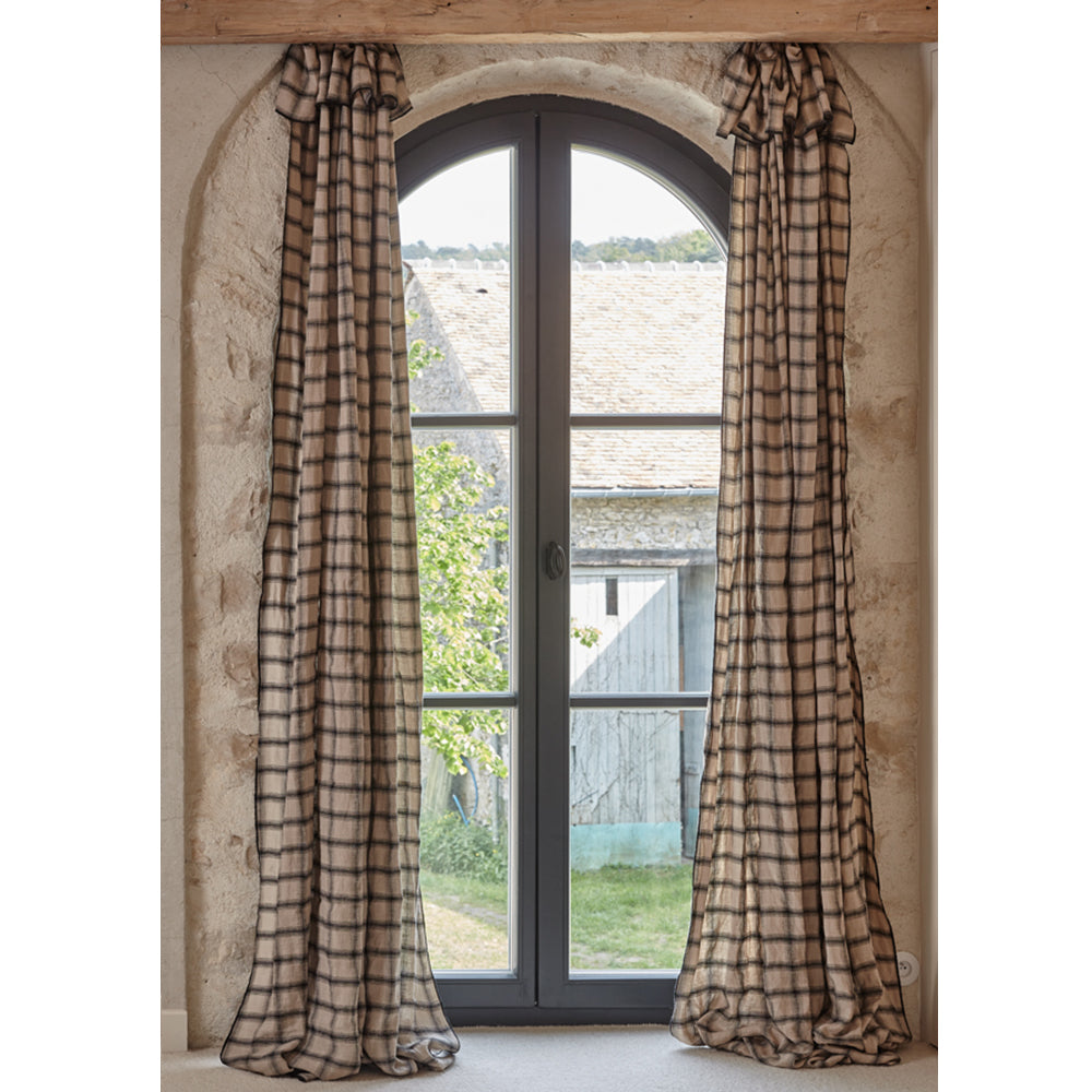
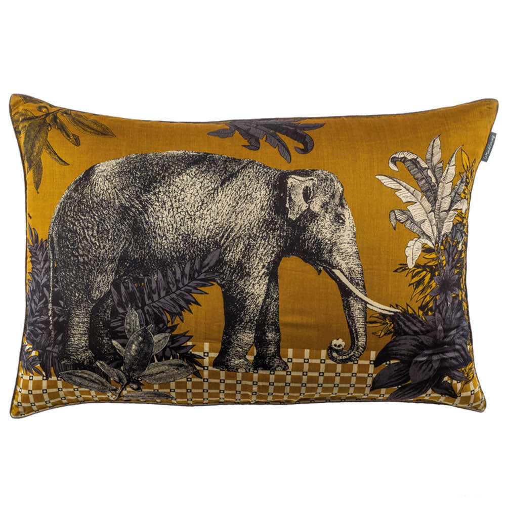
Today we are seeing a real change in our interiors: we are gradually moving away from totally white and neutral atmospheres to return to more nuanced, more sensitive and more connected palettes with nature. The Le Monde Sauvage spring/summer collection fits perfectly into this evolution through three themes:
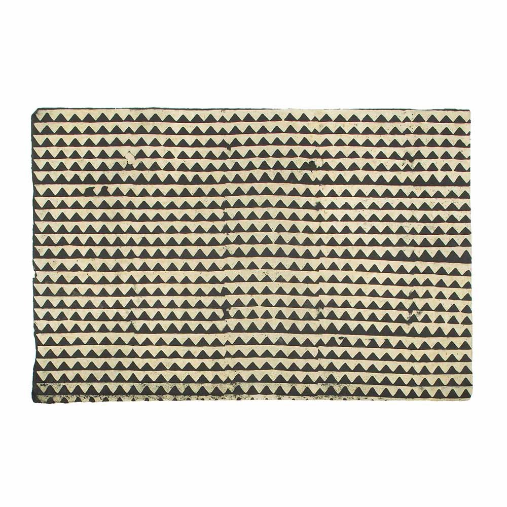
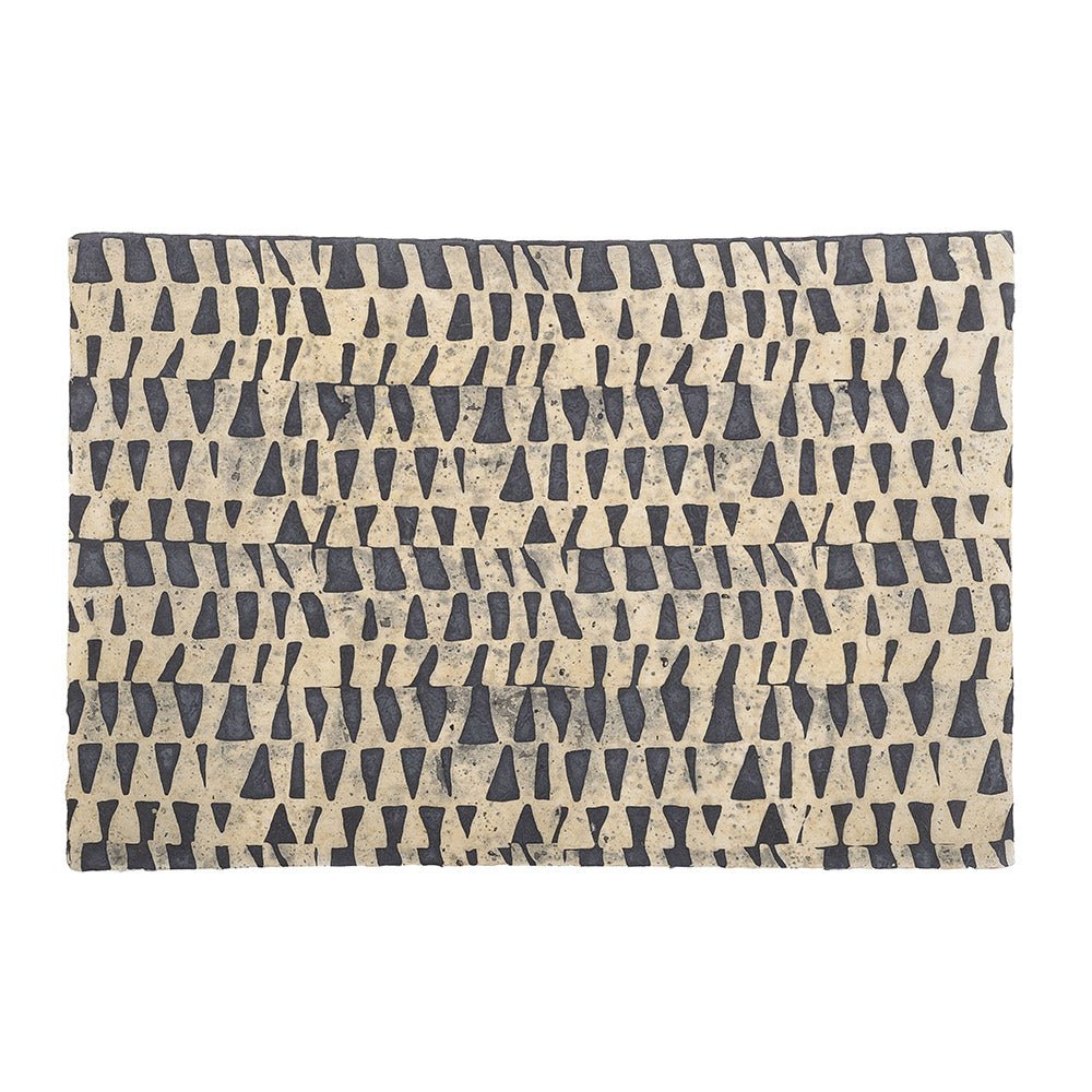
The Wild Shadow theme offers deeper, more grounded palettes, echoing the current need for reassuring and timeless interiors.
The Powder Green theme perfectly illustrates the enthusiasm for plant-based and powdery shades, which bring softness and freshness while remaining elegant and easy to live with on a daily basis.
Finally, the Blue Sun theme responds to a need for escape and light, with associations that already evoke more joyful and luminous summer atmospheres.


What I particularly appreciate about these palettes is that they contain everything that makes for a successful colour harmony: different shades that create both visual and emotional balance, contrasts that add depth, and well-chosen accent colours that bring that little touch of boldness that often marks the final success of an interior. I must admit, I have a soft spot for the Powder Green palette, which blends beautiful, vibrant colours while remaining soft enough to be easily integrated into a room.

